Good design patterns: the command palette
06 September 2020How a simple searchable list of actions is a boon for your user's experience
Concept
I first encountered the name "Command Palette" from the Sublime Text editor. The idea is simple: your application opens a menu with a textual list of possible actions that your application can perform. Add a searchbar on top that's active immediately, so that one can start typing to filter down the options until the desired action is found.
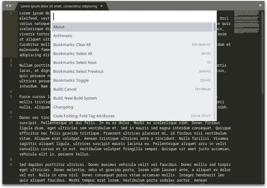
These options are gathered from the application's menu bar, as well as from
submenus within those menu options.
As you search, the matching text in each option can be highlighted, drawing your
attention to the region of the option you're likely to be interested in.
Additional information about each option can be displayed, including associated
keyboard shortcuts, or the path to the option in the menu bar.
The search term can not only filter based on the name of the option, but also on
hidden things a user might know and search for, e.g. the description of an
action, or a command to run (cmd for Command Prompt).
Command palettes are most powerful when they can be opened through a keyboard
shortcut, as that enables simple keyboard-driven interaction with the
application.
Other editors took inspiration from this feature of Sublime Text, including Visual Studio Code and Atom, so clearly the concept is rather popular and functional.
Benefits
The primary and universal benefit is discoverability: a user can use (limited)
natural language to describe what they want to do, and the application presents
them with the closest-matching results. This lets users quickly access and
perform what they need, reducing their frustration, particularly those who are
new to your application. The worst thing you can do is force new users to dig
through several menus from a menu bar or ribbon, hoping that your developers and
designers have organised things in a sensible manner1.
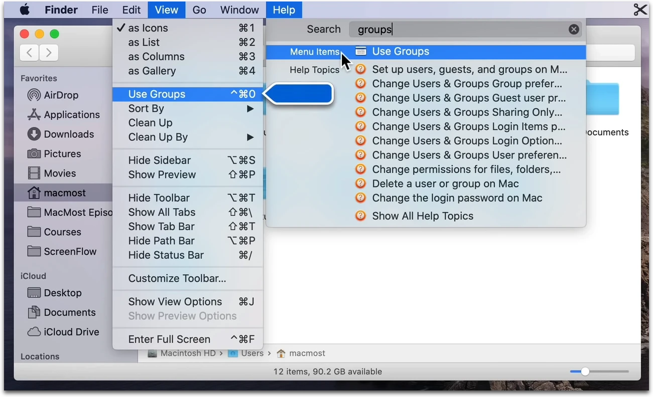
Users that prefer the menu bar interface can be taught where to find the actions
they searched for, e.g. by showing a sequence (File → Submenu → Action), or
by expanding the menu to show the item, as macOS does:
Power users like me, who dislike being forced to use a mouse, will
greatly appreciate having an effective keyboard-driven UI.
The command palette can also show keyboard shortcuts associated with each
action, so one can easily learn even faster ways of performing regular actions.
It's also a significant improvement over the traditional menu bar when it comes
to keyboard control. The process for a menu bar involves hitting
Alt
, looking for an underlined letter or using the arrow keys,
expanding a submenu, then repeating the navigation process until ones reaches
the desired action.
Conversely, with the palette, one can bring it up with a keyboard shortcut, type
one or two words, and hit enter. Admittedly, the former also allows muscle
memory to be built up, but the sequence of key presses is non-obvious and
specific to each action, and hence takes longer to learn. A word or two
is much easier to remember, compared to a seemingly-random sequence of letters
which often has no particular relation to the menu items I'm activating.
Doing it right
1. Show additional contextual information
macOS takes the command palette concept one step further by building the feature into the OS: all apps that use the standard menu bar will have automatically have a search bar under the Help menu, with the hotkey ⌘ Command ⇧ Shift / . This is a feature I loved while using macOS. No matter how badly designed the application, this feature would save me the hassle of using a pointer and keep my hands on the keyboard most of the time.
Such a feature is sorely needed in many Windows applications, many of which
I've found to be heavily mouse-driven, sometimes even forgoing the
traditional menu bar, and thus removing an avenue for keyboard navigation.
The Windows 10 stock apps like the calender and email client are particularly
guilty of this. Apparently we have their new "Design System",
Fluent, to blame.
An alternative to visually showing the location of options in the menu would be to show a textual representation of its location.
Showing the keyboard shortcuts of each option helps the user speed up in the future by skipping the command palette entirely.
2. Avoid inconsistent or astonishing search results
The command palette is at its best when users can reliably include it in their workflows within your application. The same query should return the same result, no matter how quickly it was typed in (within reason: new features and context are bound to change some results).
An example of this done poorly is the Windows 10 search bar: one can use it as an application launcher by searching for the name of the desired application or system menu and simply hitting enter. But there are problems that occasionally cause frustration, such as the applications you want randomly not appearing or internet search results being displayed instead of locally-installed applications. In order to fix this, the search menu should:
- Wait until the local search is complete before executing the first result
- Prioritise local results over internet results (and give an option to disable internet searches)
Some command palettes such as Rofi and Wofi sort matching options based on how frequently you've chosen those options. I personally find this more detrimental than helpful, as over time the order of options will change, affecting the results of quick searches I've memorised. My usage pattern involves typing the minimal amount to get my desired option as the top result, then hitting enter - if there are two similar options I regularly use, I've found they can clash and make it difficult to learn the quickest way to pick one or the other. For users who rely on learning the bare minimum they need to type to get the desired result without inspecting the search results, I'd recommend making such behaviour optional.
3. Sort results sensibly
The sorting issues I encounter when using Wofi would be less impactful if the result sorting used additional heuristics than simply how often the user has selected it. Here are some additional things to consider and prioritise:
-
Did search term match the shown text or hidden text?
The shown text should be prioritised, as that is what the user is more likely to search for if they know exactly what they're looking for. -
Did search term match the beginning of (or entire) word(s)?
People are much more likely to start typing words from their beginning, so prioritise such matches. Similarly, whole word matches should be prioritised over partial word matches.
4. Show as many options as available
The worst crime against discoverability is simply withholding options from your users in a command palette. The command palette should provide you with as many options as are available through traditional means, e.g. the menu bar or search bars within the application. Sub-menu items can also be expanded into the palette, perhaps with a prefix to indicate what menu they come from. To take this even further, if necessary, palette options could open another palette with sub-options.
This is another issue I take with Windows 10's search bar: it intentionally hides things like old system menus in favour of pushing their often less-useful modern counterparts. This is more understandable if the new option is a complete replacement, but otherwise it's an unnecessary limitation of the search function.
Summary
The command palette is a simple design pattern, and so it's easy to learn. It lets your users find what they need more easily and quickly than other traditional menu designs, teaches them what your application can do, and how to do it.
This design is one I greatly appreciate having in any application, and I'd love to see it used more widely in the future.
For an example of what not to do, see Martin Keary's critique of Sibelius' UI